Web Design 101: 100% Tappable
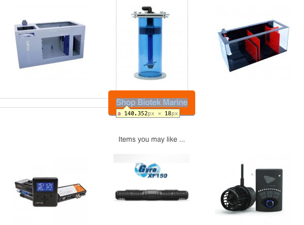
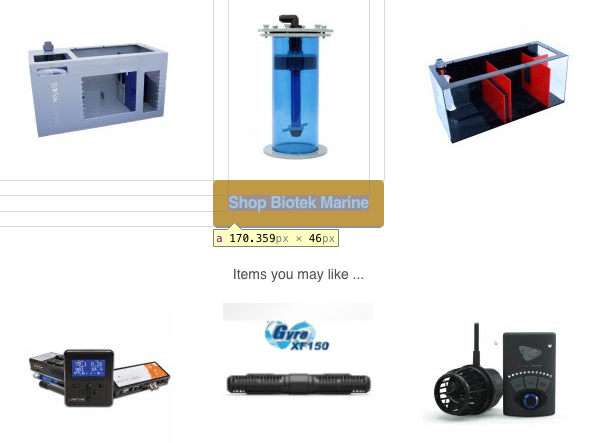
I see this one all the time: something that looks like a button, but only a portion of it is tappable. Consider this example from a recent email I received (emails are notorious for this crap):

This screenshot shows a very large call to action, which is good. Unfortunately, as the screenshot illustrates, the majority of the “button” is a table cell and the tappable link is just the text inside it.
The markup itself isn’t horrible; here’s a distillation of that row in the design:
<table>
  <tbody>
    <tr>
      <td>
        <a href="…">Shop Biotek Marine</a>
      </td>
    </tr>
  </tbody>
</table>
The problem is that the 15px padding and overall button styles were put on the table cell rather than the link itself. Setting the link to have a display of “block” or “inline-block” would allow it to be given vertical padding (which is probably the issue the designer was struggling with here). Then the remainder of the styles could be migrated without adjusting the design at all.

When you design something that looks interactive, always make sure the whole thing is actually tappable. It will go along way toward reducing user frustration.
Webmentions
-
@Aaron I am also irked by the inverse, where there's an interactive control that looks like a big empty void: https://codepen.io/cbirdsong/pen/gOdQmYr
Sneaky interactivity -
@cbirdsong As in when block elements are interactive, but lack a visual affordance to clue you in to their boundaries? If so, agreed.
Comments
Note: These are comments exported from my old blog. Going forward, replies to my posts are only possible via webmentions.Just the other day I saw something related to this.
I was perusing a marketing firm’s website and saw that they broke down their process into four main steps. Each step is represented by a simplistic illustration, a title, a short summary, and a generic “Read More” link below (which in itself could be improved, but I digress). Here’s the thing: the entire containing element reacts to the cursor hovering over it by slightly darkening the background, but only the Read More text is actually clickable.
Somebody actively set a
:hoverselector on the container element because they could. No other reason for it. They just could.This is exactly why we will always have a job…