The Web Should Just Work for Everyone
I had the great pleasure of delivering the following talk at the Edge Web Summit on April 4th. The talk is largely about accessibility with a push for thinking about the future of the interface and how considering accessibility now will help us prepare for a world of “headless UIs”.
We, as an industry, tend to have a pretty myopic view of experience. Those of us who work day-to-day in accessibility probably have a broader perspective than most, but I would argue that even we all fall short now and again when it comes to seeing the Web as others do.
I’m, of course, talking about accessibility. Now if you’re like most audiences, I’m guessing when you hear the word “accessibility” you probably think “screen reader”. That’s ok. Screen readers are certainly one part of the assistive technology spectrum, but my hope is, that by the end of this talk, when someone says “accessibility” you instead think… “opportunity”.
Accessibility is concerned with accommodating disabilities, but our understanding of what a disability is has changed over time. In the 1980s, the World Health Organization defined a disability as a personal attribute:
In the context of health experience, a disability is any restriction or lack of ability (resulting from an impairment) to perform an activity in the manner or within the range considered normal for a human being.
They have since updated their definition of a disability to be more context-dependent:
Disability is not just a health problem. It is a complex phenomenon, reflecting the interaction between features of a person’s body and features of the society in which he or she lives.
The points of interaction between a person and society are where disability happens. It’s our responsibility to know how our designs affect these interactions.
If we use our own abilities and biases as a starting point, we end up with products designed for people of a specific age, language ability, tech literacy, and physical ability. Plus those with specific access to money, time, and stable network connections.
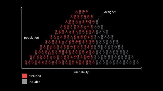
When it comes to people, there’s no such thing as “normal”. For example, the interactions we design with technology depend heavily on what we can see, hear, say, and touch. If we’re designing with ourselves as a baseline, we can overlook people with circumstances different from ours.
I love exercises that create opportunities for revelation. One of my favorites originates from John Rawls. Rawls was a philosopher who used to run a social experiment with students, church groups, and the like. In the experiment, individuals were allowed to create their ideal society. It could follow any philosophy. It could be a monarchy or democracy or anarchy. It could be capitalist or socialist. The people in this experiment had free rein to control absolutely every facet of the society… but then he’d add the twist: They could not control what position they occupied in that society.
This twist is what John Harsanyi—an early game theorist—refers to as the “Veil of Ignorance” and what Rawls found, time and time again, was that individuals participating in the experiment would gravitate toward creating the most egalitarian societies.
It makes sense: what rational, self-interested human being would treat the elderly, the sick, people of a particular gender or race or creed or color, poorly if they could find themselves in that position?
We’re often told accessibility is only concerned with folks with “special needs.” Well news flash: we all have special needs. Some we’re born with. Some we develop. Some are temporary. Some have nothing to do with us personally, but are situational or purely dependent on the hardware we are using, the interaction methods we have available to us, or even the speed at which we can access the Internet or process data.
Sometimes disability is a temporary thing. A short-term injury and illness affect the way people interact with the world around them. Looking into bright light can cause brief visual impairment. Being sick with a cough makes it hard to speak. Wearing a cast can severely limit a person’s ability to lift an everyday object.
On the more technical side of things, small touchscreens can be awkward to interact with is you’re fat-fingered like me. Glossy screens can be difficult to read under glaring light. Low-contrast text can be difficult to read when you turn the screen brightness down to conserve battery life on your mobile device.
Recognizing that we all have special needs leads us to make better decisions as designers and developers. When we understand that disability is a universal and dynamic way of interacting with the world, it can become something else as well: a new source for creativity. Our impact can also expand, as our inclusive designs reach a greater number of people.
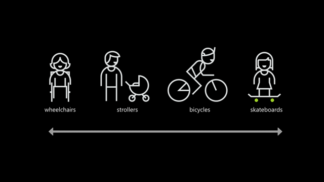
Designing for people with permanent disabilities can seem like a significant constraint, but the resulting designs can actually benefit a much larger number of people. For example, curb cuts in sidewalks were first created to make it safer and easier for people in wheelchairs to cross the street.

But curb cuts also help people with a wide range of circumstances, from kids riding bicycles, to parents pushing strollers, to workers hauling heavy equipment.
Similarly, high-contrast screen settings were initially made to benefit people with vision impairments. But today, many people benefit from high-contrast settings when they use a device in bright sunlight. The same is true for remote controls, automatic door openers, voice controls, and much more. Designing with constraints in mind is simply designing well.
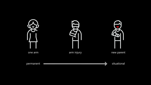
By designing for someone with a permanent disability, someone with a situational disability can also benefit. For example, a device designed for a person who has one arm could be used just as effectively by a person with a temporary wrist injury or a new parent holding an infant.
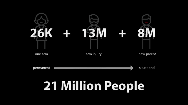
Being mindful of the continuum from permanent to situational disabilities helps us rethink how our designs can scale to more people in new ways. In the United States, 26,000 people a year suffer from loss of upper extremities.
But when we include people with temporary and situational disabilities, the number is greater than 20M.
As a web design philosophy, progressive enhancement is right in line with the egalitarian inclusive design approach. It calls for equality of opportunity, but doesn’t require equality of outcome. It’s okay for different folks to experience your products in different ways as long as everyone can accomplish the task they set out to do.
[Progressive enhancement] keeps the design open to the possibilities of sexiness in opportune contexts, rather than starting with the ‘whole’ experience that must be compromised.
At its essence, progressive enhancement is about being good designers. The definition of design is “to devise for a specific function or end” Classically, it means “to indicate” and comes from the medieval Latin: designare, meaning “to mark out”.
I’ve been amazed at how often those outside the discipline of design assume that what designers do is decoration—likely because so much bad design simply is decoration. Good design isn’t. Good design is problem solving.
As Jeff Veen so astutely observed in this quote, there is a lot of bad “design” out there that is more concerned with aesthetics than problem solving.
When we are concerned with the user interface, it can sometimes be at the expense of the user experience.
It is possible to have something both beautiful and highly functional.

24 Ways is an advent calendar for web professionals. It’s a magazine of sorts, but it is both highly interactive and accessible. The site’s developers employ a handful of features from the ARIA spec to increase the accessibility of the site.
One such feature is ARIA landmarks, which identify key areas of a web page. Such as the primary header or “banner” of a site.
<header class="banner" role="banner" id="top">
  <h1 class="banner_logo">
    <a href="/" rel="home">24 ways <span>to impress your friends</span></a
    >ma
  </h1>
</header>
The main content.
<main role="main">…</main>Content concerned with easing navigation of the site.
<nav class="navigation" role="navigation" id="menu">
<h1 class="hidden">Browse 24 ways</h1>
<ul class="nav nav-topics">
<li class="nav_item">
<a href="/topics/business/" data-icon="♕">Business</a>
</li>
…
</ul>
…
</nav>Or even information about the content, such as copyright designations.
<footer class="contentinfo" role="contentinfo">
<p class="contentinfo_copyright">
<small
>© 2005-2016 24 ways and our authors.
<a href="/about/#colophon">Colophon</a></small
>
</p>
<p class="contentinfo_social">
<a href="http://feeds.feedburner.com/24ways" rel="alternate"
>Grab our RSS feed</a
>
<a href="https://twitter.com/24ways" rel="me">Follow us on Twitter</a>
<a href="/newsletter">Subscribe to our newsletter</a>
</p>
</footer>Users browsing with an ARIA-aware screen reader can use these landmarks to quickly navigate through a document.
This example hints at a simple reality: Every interface is a conversation. We engage our users directly in an effort to inform them, entertain them, or persuade them to act in a particular way. How this conversation goes directly affects the experience our users have.
Now this may sound great as a quote to share on Twitter—feel free—but it’s absolutely true. And it’s going to become even more important that we pay attention to this conversation as personal assistants—you know, “assistive technology”, it’s right there in the name—begins to play a larger part in our users’ lives.
We need to consider the experience when our products are stripped to their essence. When there is no visual design to entice our users to overlook the fundamental flaws in the design of our interfaces. When there is no UI to help them manage the cognitive load of accomplishing a given task.
Considering this now will put you way ahead of your competition and empower your users to do more with your products. It can seem like a daunting task when we’ve spent so much time fixated on how to enable our users to accomplish key tasks on a screen, especially in a responsive context. But what is responsive design about if not accessibility? Responsive design is concerned with presenting the most appropriate visual experience given the constraints of a screen’s size.
Similarly, conversational interfaces are concerned with the way we communicate with our users, whether there is a screen or not and whether the user can see it or not. This isn’t new, it’s a challenge we’ve tackled before…
Let’s take a trip back in time to one of the earliest computer games: Zork. Zork was written between 1977 and 1979. It’s a text-based adventure game that operates a lot like a game of Dungeons & Dragons—with the program serving the role of gamemaster.
As you move from location to location throughout the game, the program describes the environment and notes objects and people you can interact with. You type what you want to do and the program tells you the results of your actions.
West of House
You are standing in an open field west of a white house, with a boarded front door.
There is a small mailbox here.
> open mailbox
As this was the early days of computer gaming, you might think Zork’s interactions would be simple noun-verb combinations—“kill troll”—but Zork was more sophisticated than that. Its parser was could understand far more complex commands like “hit the troll with the Elvish sword”. This made the experience far more natural, as if you were playing a table top game with friends.
Whether Zork or a webpage, every interface is a conversation. When I create a homepage, I’m talking to visitors as if we’ve just met. I’m explaining what they can do on my site (and, in some cases, why it matters). If I’m designing a product page, the conversation is a little different. I’m explaining to my users what a particular object or service is, what it does, and how it will benefit them. I’ll skip the BS sales pitch and talk honestly about the product’s benefits. If I’m designing a contact form, I want to help my users get a message to me quickly and efficiently. I’m also going to set some expectations around how long it will take me to get back to them (and, of course, I’ll need to abide by that promise). Even the humble status update is a conversation. I’m asking a question and then stepping back and letting my users speak. The floor is theirs. (But I’m probably mining what they say for data so I can market to them later.)
Conversations consist of words, so it should come as no surprise that we should choose our words carefully. When talking to people, things generally go better when you talk to them like they talk to you. This is a lesson Facebook learned the (somewhat) hard way.
Over the 2011 holidays, Facebook users were uploading photos like crazy. In the span of a few days, Facebook processed more photo uploads than are contained in the entirety of Flickr. Seriously, that’s a lot of photos.
One unintended consequence of this deluge of photo uploads was a significant uptick in people asking Facebook to remove specific ones. Facebook received millions of these “photo reports”, but they made no sense: Moms holding babies reported for harassment, pictures of puppies reported for hate speech, and so on. Roughly 97% of these photo reports were dramatically mis-categorized.
Facebook’s engineers reached out to some of the users who had reported these photos to get a bit more background regarding their submissions.
At the time Facebook’s photo reporting interface provided a list of reasons users could choose from if they wanted a photo removed, but, as Facebook soon discovered, many of the reports were made because users didn’t want the photo posted for reasons other than those provided.
In some cases, it was because they didn’t like how they looked in the photo. In others, it was because the photo was of an ex-partner or even a beloved pet they’d shared with an ex-boyfriend or ex-girlfriend. The existing photo reporting tool had not done a good job of accounting for these more personal reasons for wanting a photo removed, so the Facebook engineers went to work. They added a step that asked How does this photo make you feel? The options were simple:
- Embarrassing
- Upsetting
- Saddening
- Bad Photo
- Other
The “other” option also provided a free-response text field to fill in.
With this system in place, they found that 50% of reporters who answered the new question chose one of the provided options. That was pretty helpful, but there was still a problem: 34% of the “other” respondents were writing “It’s embarrassing” in the blank rather than choosing the “embarrassing” option already provided.
What the Facebook team realized was that people were not identifying with the “embarrassing” text (or may have even thought it was referring to them, rather than assuming an implied “It’s”). A subtle shift in language was needed, so they changed the label to Please describe the photo and they updated the options to mirror how people actually talk:
- It’s embarrassing
- It’s a bad photo of me
- It makes me sad
With this subtle change, they were able to increase the percentage of photo reporters who chose one of the options provided to a whopping 78%.
Words matter. Even in something as simple and banal as a form, the words we choose set the tone for our users’ experiences and often have an affect on what they do… or fail to do. The words we choose matter even more in the world of headless UIs. Without visual aids to help a user see where they are in a form or to aid them in managing the cognitive load of our interfaces, every bit of label and helper text becomes even more important.
When Luke Wroblewski coined “mobile first”, he told us to focus on the core purpose each and every page. He was, in essence, telling us to focus on the conversation we are having with our users. This approach pays huge dividends on small screens, but when it comes to voice-based interactions, “the page” doesn’t really exist. Experience is the sum of each individual interaction.
As part of their Alexa Skills Kit, Amazon offers a ton of recommendations for designing for voice, many of which happen to be equally useful for sighted users.
Write for People
We don’t author content for ourselves. We write for others. If what we write frustrated or alienates our users, we’ve failed at our job. In their profoundly helpful book Nicely Said, Nicole Fenton and Kate Kiefer Lee offer numerous suggestions for how to write with the reader in mind:
- Be clear.
- Be concise.
- Be honest.
- Be considerate.
- Write how you speak.
They also make the recommendation that you read your work aloud. As we head into the world of voice-based interactions, that’s beta testing!
Avoid Technical and Legal Jargon
For example, if you track error codes for issues on your site, send them to your developers, but never present them to a user. Similarly, we should avoid legalese and write in plain language. Medium has done a great job of this with their Terms of Service.
When Requesting Feedback, Make It Clear That the User Needs to Respond
In perhaps the most common form example, consider the label “First Name”. It’s not terribly conversational and doesn’t beg for a response.
<label for="first_name">What’s your first name?</label>
<input name="first_name" id="first_name" />Similarly, when there’s an error, notify them of the error and, if possible, give them some clues on how to fix it.
<label for="first_name">What’s your first name?</label>
<input name="first_name" id="first_name" aria-describedby="first_name-error" />
<em id="first_name-error">
  Without your first name, I won’t know how to address you. Could you please
  provide it?
</em>When Asking a User to Choose, Clearly Present the Options
This comes into play often when dealing with forms. Ensuring radio and checkbox controls are properly associated with their labels is critical.
<input type="radio" name="agree" id="agree_yes" value="yes" />
<label for="agree_yes">Yes</label>
You can also use the fieldset and legend elements to group the related controls, but be sure to make the legend focusable or associate it with the first focusable form control in order to ensure the question is read out.
<fieldset>
  <legend tabindex="0">
    Do you agree to the terms of service for this site?
  </legend>

  <input type="radio" name="agree" id="agree_yes" value="yes" />
  <label for="agree_yes">Yes</label>

  <input type="radio" name="agree" id="agree_no" value="no" />
  <label for="agree_no">No</label>
</fieldset>We should strive for the same sort of clarity when presenting navigation options. The HTML5 nav element enables us to semantically identify an area of the page being used for navigation. It is not, however, always identified as being navigation when encountered naturally in the flow of the document. (It is when using role-based navigation like we saw earlier.) For that reason, it can be useful to provide an textual introduction to the section, even if you choose to visibly hide it. You might even consider expanding the text of your navigation items to provide additional context like I do on my site.
<nav id="nav" tabindex="0" aria-labelledby="nav-title">
  <h1 id="nav-title" class="hidden">Here’s what you can find on this site:</h1>
  <ul>
    <li>
      <a href="/about/"
        ><b class="hidden">A Bit </b>About<b class="hidden"> Me</b></a
      >
    </li>
    <li>
      <a href="/notebook/"><b class="hidden">Entries in My </b>Notebook</a>
    </li>
    …
  </ul>
</nav>NPR has multiple navigation elements on the page and they use ARIA to label them without adding additional tags. Instead, they use the aria-label attribute to distinguish them.
<nav class="global-navigation" role="navigation" aria-label="main navigation">
  …
</nav>Prompts Should be Short, While Still Being Clear
In a 1933 lecture at Oxford, Albert Einstein famously said
It can scarcely be denied that the supreme goal of all theory is to make the irreducible basic elements as simple and as few as possible without having to surrender the adequate representation of a single datum of experience.
Or, as Roger Sessions paraphrased it
Everything should be as simple as it can be but not simpler.
Clear and concise writing is the hallmark of great content. We need to resist the urge to write for writing’s sake. We write in the service our audience, not for ourselves.
Government websites are some of the worst offenders in this area. Consider this lovely passage:
Heavy rains throughout most of the State have given an optimistic outlook for lessened fire danger for the rest of the season. However, an abundance of lightning maintains a certain amount of hazard in isolated areas that have not received an excessive amount of rain.
It could be written far more clearly as
Heavy rains throughout most of the State have lessened fire danger for the rest of the season. However, lightning threatens isolated dry areas.
In the UK, the Government Digital Service has made great strides overhauling excruciatingly painful content and making it easier to read and understand. One such example is their overhaul of the Accelerated Possession process that allows landlords to evict a tenant.
The original paper form asked for the address like this
The claimant seeks an order that the defendant(s) give possession of:
(If the premises of which you seek possession are part of a building identify the part eg. Flat 3, Rooms 6 and 7)
Before requesting the type of property concerned
(‘the premises’) which is
☐ a dwelling house
☐ part of a dwellinghouse
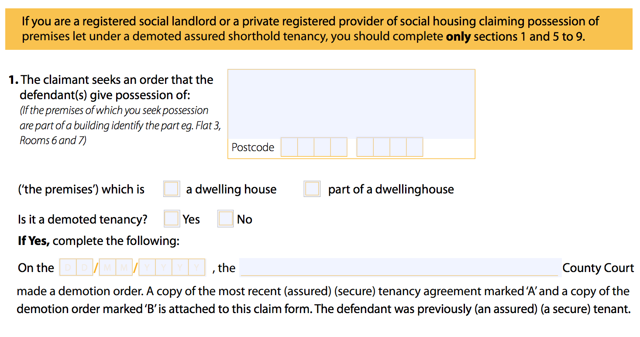
Clear and to the point, right?
The GDS went to work and streamlined the process in plain language:
What kind of property do you want to take back?
◎ A self-contained house, flat or bedsit
◎ Room or rooms in a property.
Tenants may share kitchen or bathroom
Then they allow you to lookup the property or manually enter the address.
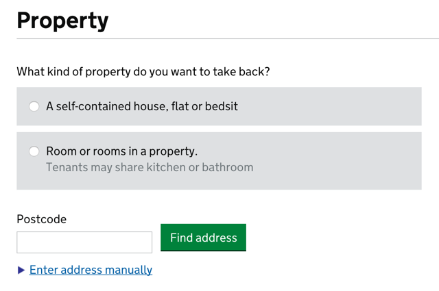
While not specifically designed for the future of headless UIs, this form is prepared for their eventuality.
Ask Only Necessary Questions
We show our users respect by respecting their time. Obviously straightforward, brief writing is one way we do that, but another is to reduce the time it takes to complete a task. Many forms are brimming with fields to be filled in. In some cases, the vast majority are purely optional. And while it may be easy to spot the required fields visually, bypassing them in an aural interface can be incredibly difficult.
User experience designers have been pushing for simplified forms since… well, as long as I can remember. Users appreciate them, they tend to result in better data, and they also tend to convert better than long forms. And when it comes to voice-based interactions, they will become a necessity. No one is going to want to spend 15 minutes working their way through a 15 question registration form when all that’s required is their email address and for them to choose a password.
On a similar note, we should avoid slicing fields into multiple parts if at all possible. For instance, you still see fields like this one, asking for a US phone number, quite often:
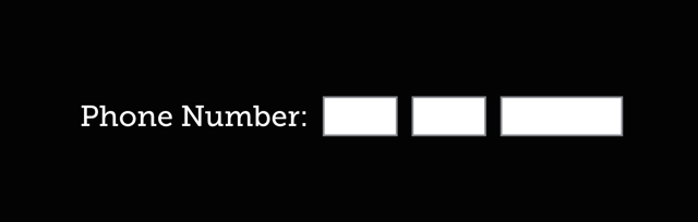
When interacting with this construct via voice, a user will be required to supply three separate values. In order to do so, each field would require a label. Most developers only know how to label the first of those three boxes and users would be really confused if you asked them for their exchange code and line number.
HTML5 introduced a host of new field types that consolidate phone numbers, dates, times, and other complex data types into single fields. Use them! As an added bonus, most enforce content validation and formatting rules for you automatically.
Present Information in Consumable Pieces
Like computers, we humans have a finite amount of “working memory”. The amount of mental resources required to operate an interface is called its “cognitive load”. When the amount of information we need to process exceeds our capacity to handle it, we can miss important details, have trouble concentrating, and become frustrated.
We deal with cognitive load in GUI design all the time, but in voice-based interactions, there are no visuals to act as signposts and provide reminders about where we are and what we’re doing. This is why it is critical to break complicated tasks down into simpler ones and eliminate excess noise (like non-required fields). We can also reduce cognitive load by chunking search results and other list-type content into small groups, asking the user if they want more before loading and presenting them.
The top seller in the garden department is Repel Lemon Eucalyptus Natural Insect Repellent, 4-Ounce Pump Spray
Would you like to hear the rest?
As human beings, we all have special needs, but as designers and developers, it can sometimes be difficult to diagnose potential issues within our products when it comes to accessibility. Especially if we don’t typically experience that need or are unfamiliar with the tools used to address it.
To that end, my colleagues have been hard at work to make it easier to enhance the accessibility of our products. The first tool I want to discuss is the F12 developer tools in Edge.
As Andy Sterland mentioned in his talk, in a forthcoming release of F12, the inspector will surface accessibility information about each node in the DOM. Let’s take a look at an example:
Here we have the forthcoming redesign of HTML5accessibility.com and if I inspect the section containing the test results, I can see information about that section element. On the right hand side, you’ll notice an inspector tab dedicated to accessibility information such as the node’s accessible name, it’s role, whether it’s keyboard focusable, ARIA properties assigned to it (in this case, aria-label), and so on.
Adding this functionality into F12 lifts the veil from the way Edge exposes the DOM to assistive technology and will go a long way toward helping us fine tune our experiences for AT, including screen readers and virtual assistants.
Another area where we are doing some work is within Narrator itself. When testing with screen readers, it can be quite tempting as a sighted user, to leave your screen on so you can follow along. Sadly, that action directly prohibits you from experiencing a site or application the way folks with visual impairments or in a headless UI scenario do. It can cause you to miss things or assume something makes sense when, in fact, it doesn’t.
To help address that, Narrator will soon sport a “Developer Mode” that enables you to blank out a single app (such as the Edge browser window) so you can experience it without any visual access to the UI. (You can also use it for installed and hosted apps.)
Here we see the HTML5accessibility site again. If I flip on Developer Mode in Narrator, the Edge browser window goes black and I can see where the focus carat moves (the blue box), but I can’t see the design. For diagnostic purposes, the contents being read by Narrator are also presented as text on the screen in the position of the element (which can help with identifying where the issue was when you come back out of Developer Mode).
Microsoft is committed to improving the accessibility, not only of its own products, but of the Web as a whole. These two tools are only a few of the many ways we are doing that today.
Obviously, part of that is continuing to evolve and improve the accessibility of the Web for users browsing in Edge, whether they are using Narrator or other screen readers like Jaws or NVDA.
But, in addition to that, Microsoft—in partnership with Carnegie Mellon and Stanford, Adobe, AT&T, Dropbox, Facebook, Intuit, LinkedIn, and Yahoo—helped launch TeachAccess. This site is an effort to address the “lack of awareness and understanding of basic accessibility issues, concepts and best practices” in the world of CS and HCI education. If successful, which I sincerely hope it is, it will help address the dire need we have for a more accessibility-aware workforce building for the Web.
Similarly, Microsoft Design has shared their fantastic set of resources for improving the inclusiveness of design. They have created a guide as well as a set of activities you can use to get your team into the Inclusive Design mindset.
And in the not too distant future, we’ll be publishing a series of in-depth posts about accessibility on the Microsoft Edge Dev Blog. These will tackle topics like how we re-architected Edge for better ARIA support and name computation, working with HTML5 accessibility to improve the tests, and how we can enable automated testing in order to discover accessibility regressions before they make it into production.
We do this because, with accessibility in mind, we can improve the lives of billions of people. Friends, family, neighbors, and complete strangers, all of whom deserve the opportunity to access the products we create regardless of the different ways we experience the world.
Ultimately “accessibility” is not about disabilities or the technologies we use to address them, it’s about people. Sure, we’ll make it easier to look up movie times and purchase tickets to see the latest Transformers debacle, but we’ll also empower the nearly 900 million people globally—over 60% of whom are female—that are illiterate by enabling our sites to be used purely via voice, even translated in real-time into their native language and dialect.
We will create new opportunities for the poor and disadvantaged to participate in a world that has largely excluded them. You may not be aware, but 80% of Fortune 500 companies—think Target, Walmart—only accept job applications online or via computers.
We will enable people who have limited computer skills or who struggle with reading to apply for jobs with these companies.
We will empower immigrants to read lease agreements and postal mail in languages they haven’t fully grasped yet.
We will enable people with visual disabilities to vote, even on paper ballots, without human assistance.
We can help bridge the digital divide and the literacy gap. We can create opportunities for people to better their lives and the lives of their families. We have the power to create more equity in this world than most of us have ever dreamed.
This is an incredibly exciting time, not just for accessibility, not just for user experience, not just the Web, but for the world! I can’t wait to see how awesome you make it!
Thank you!
You can watch (or listen) to me present this talk (albeit with a bit of technical difficulty) over on the Channel 9 website.
Webmentions
Likes
Shares